
🪞 Introduction: Why Boho Wall Art Dominates the Feed
Let’s be honest—you didn’t scroll past that sun-drenched living room with the tasseled throw and the perfectly placed cactus without pausing to stare. We’ve all stopped mid-scroll for a boho wall art moment that made us feel something. And whether it was a soft sun print, a gallery of earthy tones, or that one-perfectly-framed piece of minimalist art glowing in golden hour light… there’s no denying it:
Boho wall art owns Instagram.
But here’s the secret: it’s not just about slapping a macramé on the wall and calling it a day. There’s an art to styling walls that not only photograph beautifully, but also feel lived-in, curated, and real. And you don’t need a degree in design or a filter named after a Greek island to pull it off.
You just need a little strategy—and a lot of soul.
That’s where this post comes in. We’re pulling back the curtain on what makes boho wall art truly Instagram-worthy. From lighting tips and styling hacks to choosing pieces that reflect your aesthetic, you’ll learn how to turn your blank walls into the most double-tapped part of your home.
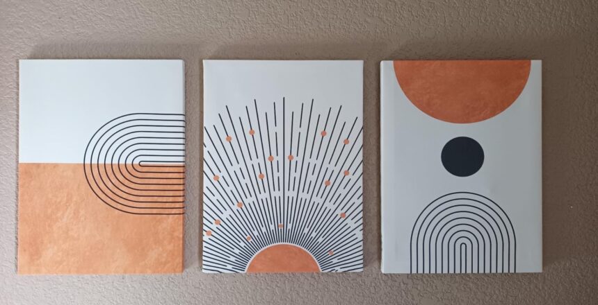
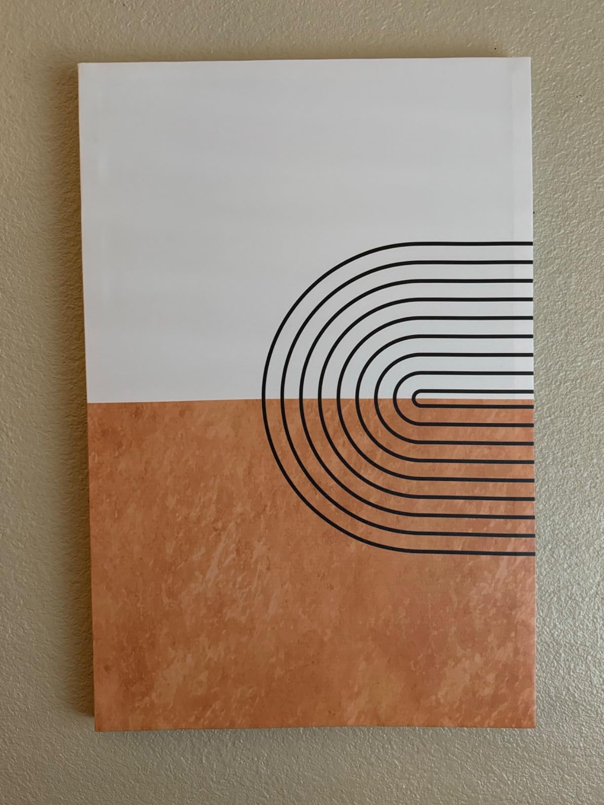
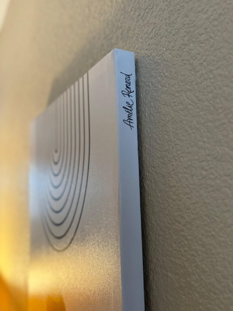
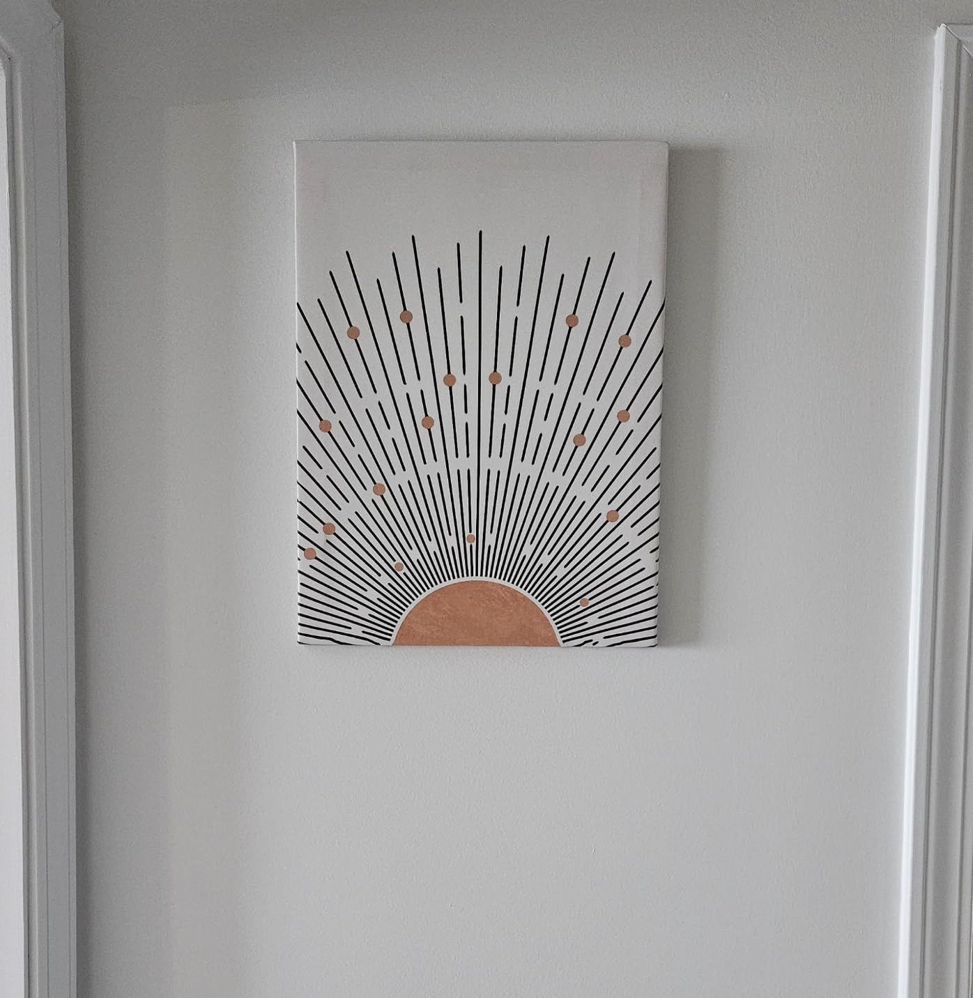
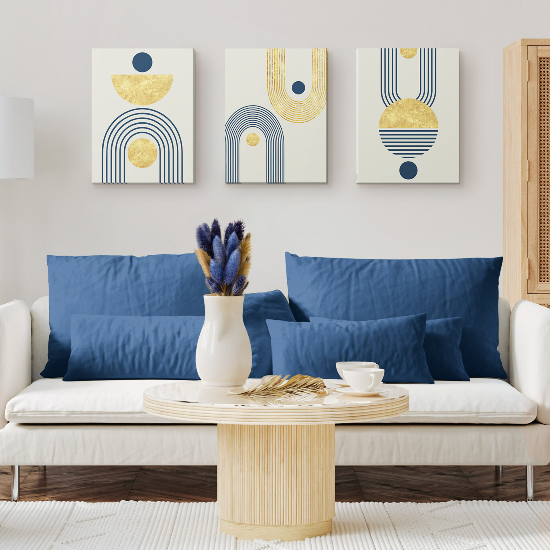
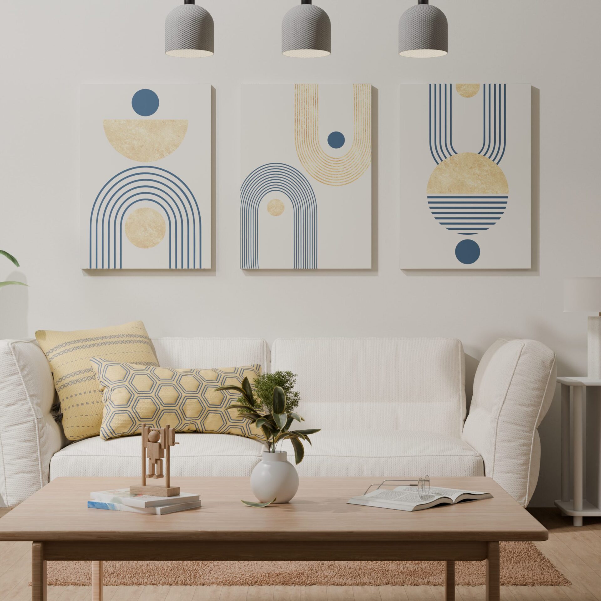
And if you’re just starting your boho wall art journey? Homey Panda is a cult favorite among home décor lovers for a reason. Their carefully curated boho wall art line features the emotive, earthy work of Amélie Renard—a French artist whose designs are made for content creators and calm-space lovers alike. With soft silhouettes, muted palettes, and just enough edge, her pieces work in any room, any feed, and any season.
Let’s start with the core of your Instagram aesthetic: understanding your boho vibe.
-
🎯 Know Your Boho Vibe: Which Instagram Aesthetic Are You?
Before you pick up a hammer or obsess over the perfect filter, pause. If you want your boho wall art to pop on Instagram (and feel cohesive IRL), you’ve got to know your aesthetic identity. Yes, boho is a vibe, but it’s also incredibly versatile—and figuring out which boho path you’re walking will shape everything else.
🌿 The Main Boho Aesthetic Types (and How They Translate to Wall Art)
Let’s decode a few of the most Instagram-popular boho substyles, so you can style with intention—not confusion.
1. Scandinavian Boho
Think clean, neutral, airy. This style marries the soft edges of boho with the minimalism of Scandinavian interiors.
Wall art style:
-
Neutral line art
-
Monochromatic prints
-
Minimalist shapes with lots of white space
-
Black and white photography
Color palette: Off-white, beige, greige, soft black accents
Instagram feel: Calm, polished, with that “I have my life together” vibe (even if you don’t)
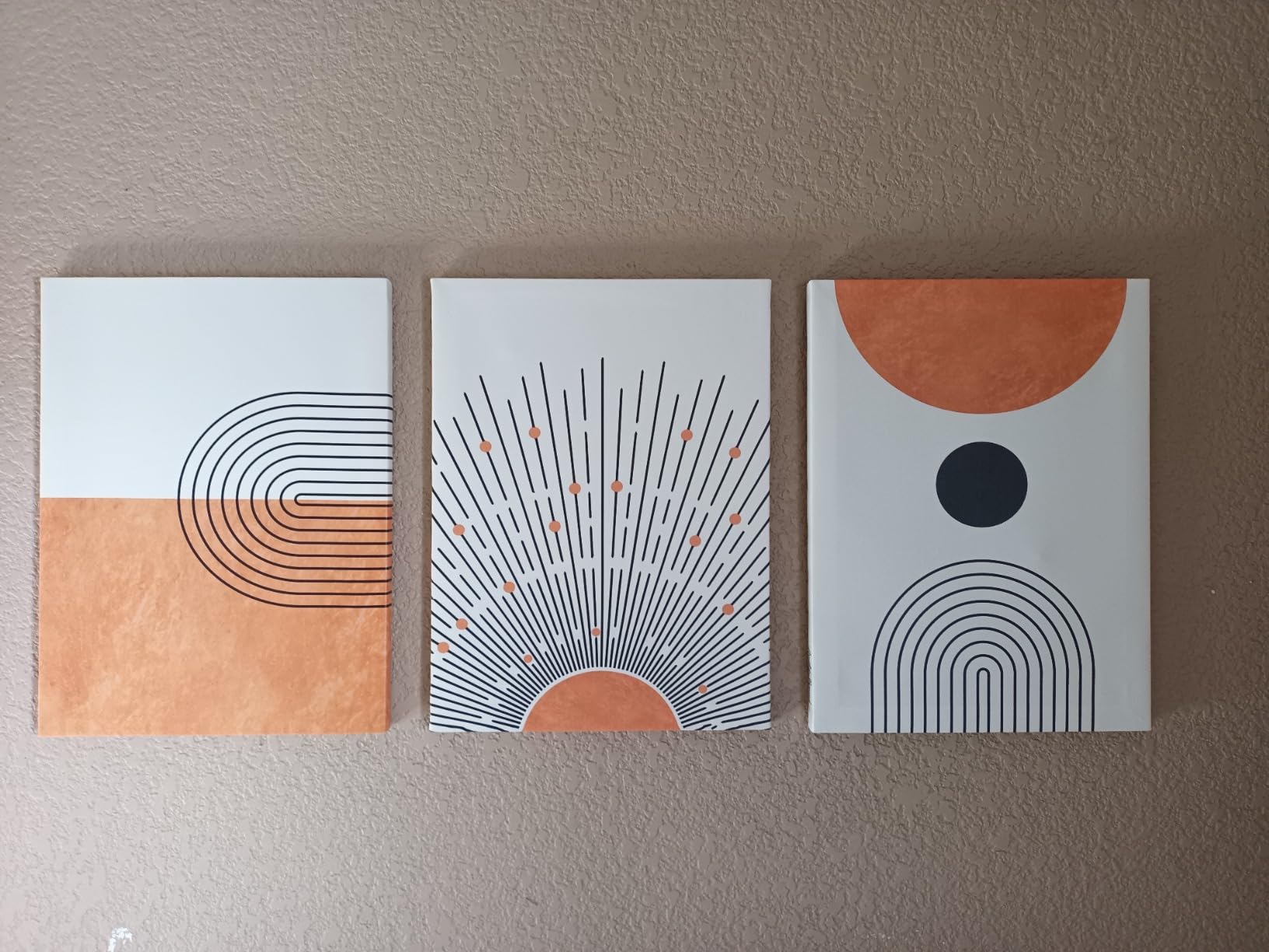
2. Desert Boho
Inspired by the southwest, this aesthetic is bold, warm, and sun-kissed. Think Joshua Tree meets Pinterest.
Wall art style:
-
Sunburst or sunset-themed prints
-
Terracotta-toned abstracts
-
Cactus sketches or desert landscapes
-
Layered textures: woven wall hangings + earthy-toned prints
Color palette: Terracotta, rust, mustard, sand, deep green
Instagram feel: Warm, grounded, effortlessly cool
3. Eclectic Boho
A favorite for maximalists and collectors. This look is playful, layered, and filled with personality.
Wall art style:
-
Vintage posters or travel prints
-
Bold patterns and color
-
Gallery walls with mismatched frames
-
Mirrors, plates, and 3D objects as part of the display
Color palette: Anything goes—but stick to a core trio for cohesion
Instagram feel: Wild, expressive, art-filled. Perfect for people who thrift like it’s an Olympic sport.
4. Coastal Boho
Laid-back and light, this is boho with beachy flair. Lots of white, driftwood, and natural elements.
Wall art style:
-
Abstract ocean forms
-
Pale blue and beige palettes
-
Photography of water, beaches, or shells
-
Macramé in white or cream
Color palette: White, sand, ocean blue, pale peach
Instagram feel: Relaxed, fresh, sun-washed elegance
🧭 How to Find Your Boho Energy
Ask yourself:
-
What colors do I gravitate toward in my wardrobe or saved pins?
-
Do I like spaces that are full of detail, or ones that feel open and minimal?
-
Am I more drawn to nature, art, or vintage vibes?
-
What does calm feel like to me?
This is more than a style quiz—it’s your boho blueprint. And it’s the first step to curating wall art that doesn’t just look good online, but feels right in your space.
And remember, if you’re overwhelmed with options, Homey Panda’s Amélie Renard collection is designed to blend seamlessly across all these boho substyles. Her soft, feminine lines and nature-inspired palettes make it easy to build a look you’ll love and want to share.
-
🖼️ The Rule of Visual Balance: Curating the Perfect Mix
Here’s the thing—great boho wall art doesn’t just “look good.” It feels right. You might not know why a certain wall setup makes you pause mid-scroll on Instagram, but your eye definitely knows when something’s working.
That “something”? It’s called visual balance—and it’s the secret sauce behind every truly Instagram-worthy boho wall art.
Let’s break down how to get it.
🎯 Step 1: Pick Your Anchor Piece
Start with one piece that becomes your visual anchor. This doesn’t necessarily have to be your biggest piece, but it should be the one that grounds the space and sets the tone for everything around it.
It could be:
-
A large canvas in an earthy abstract style
-
A sun or moon phase print with soft edges
-
A bold, framed piece by an artist like Amélie Renard, whose minimal yet expressive work adds just enough weight to anchor without dominating
Once you’ve chosen your anchor, you’ll build around it—like setting the foundation of a gallery or creating a visual “center of gravity” for the wall.
🖼️ Step 2: Build Around with Varying Sizes & Shapes
Variety is your best friend—as long as you balance it. Too many same-sized frames and your wall feels rigid. Too many clashing sizes and it feels chaotic.
Aim for a mix of:
-
1 large or medium focal piece
-
2–3 smaller prints
-
1 round element (mirror, basket, woven plate, or small hanging)
-
1 vertical piece (macramé or narrow print)
This combination keeps the eye moving and adds rhythm to your wall.
💡 Try arranging your layout on the floor first, then taking a photo from above. If it looks balanced from your phone, it’ll photograph beautifully once hung.
🧶 Step 3: Add Texture and Depth
Flat walls = flat photos. You need texture to make your boho wall art feel dynamic—especially through a camera lens.
Here’s how to do it:
-
Mix framed and unframed pieces
-
Add a macramé hanging for softness
-
Use a 3D object like a ceramic sconce or a mini wall shelf
-
Layer one piece slightly in front of another using floating shelves
These small touches create shadow, contrast, and movement in photos—something that’ll set your feed apart from every copy-paste Pinterest wall.
🔄 Step 4: Negative Space = Visual Breathing Room
Instagram-worthy doesn’t mean every inch has to be covered. Whitespace matters. It gives your wall the space to breathe and lets each piece shine.
Rules of thumb:
-
Leave at least 2–3 inches between pieces in a gallery wall
-
Don’t push art all the way to the corners—keep it centered
-
For single-piece setups, give your anchor art a wide margin around it to feel intentional
Even if you’re layering lots of elements, keep balance top of mind—your eye should be able to drift comfortably from piece to piece without feeling overwhelmed.
💫 Layout Examples for Different Feeds
➤ For a Minimalist Feed:
Use 1–3 pieces max with clean spacing, monochrome tones, and light frames. Stick to symmetry.
➤ For a Warm & Cozy Feed:
Go asymmetrical. Use baskets, fringe, layered prints, and some overhanging greenery to create movement.
➤ For a Maximalist Feed:
Embrace a full gallery wall with 5–8 pieces, all tied together by a shared color palette or repeating shape (like arches or moons).
Pro tip: Many of Homey Panda’s Amélie Renard prints are designed in complementary sets, so you can grab a pair or trio and have a balanced layout straight out of the box.
Visual Balance Recap:
-
Start with a strong anchor piece
-
Mix shapes, textures, and sizes intentionally
-
Leave space for breathing room and better photos
-
Use layering and 3D elements to create visual depth
-
Let your aesthetic guide the arrangement—not a rigid grid
With just a few thoughtful choices, your wall goes from “pretty” to pin-worthy—and yes, your camera roll will thank you.
🌞 Lighting Is Everything: Make Your Wall Art Pop on Camera
Here’s a not-so-secret truth every content creator knows:
Lighting can make or break your wall.
The right light will highlight textures, bring out colors, and make even the simplest print feel elevated. The wrong light? It’ll flatten everything, cast awkward shadows, and make your perfect boho setup look meh.
So let’s talk about how to light your wall like an IG pro—whether you’re shooting for the grid or just enjoying your space IRL.
🌤️ Natural Light = Your Best Friend
If you’ve ever wondered why some walls just glow on Instagram, odds are good they were photographed using natural light.
Here’s why natural light works so well:
-
It reveals true colors
-
It creates soft shadows that add depth
-
It eliminates harsh reflections (especially with matte frames or textured art)
Best times to shoot:
-
Morning light: Crisp and clean—great for cooler-toned spaces
-
Golden hour: That dreamy, sun-washed glow everyone loves (think 4–6 p.m.)
-
Overcast days: Surprisingly great for soft, diffused lighting
💡 Tip: If your boho wall art faces a window, try pulling sheer curtains over the glass to diffuse direct light. It’ll soften everything and make your space feel instantly more photogenic.
💡 When Natural Light Isn’t an Option: Go Artificial, Intentionally
Not everyone has a sun-drenched wall or perfect daylight hours to shoot. No worries—you can still make your boho wall art shine indoors.
Try these lighting tricks:
-
Use warm white LED bulbs (2700–3000K) to mimic daylight
-
Point light toward the wall from an angle (not directly from above)
-
Use a lamp or floor light with a soft shade to create indirect glow
-
Consider a picture light above a large art piece—it adds drama and frames the piece beautifully
Stay away from harsh white light or blue-toned bulbs. They flatten your colors and make natural tones (like those in Homey Panda’s Amélie Renard prints) look dull.
✨ Avoid Glare & Reflections (Especially with Glass Frames)
Glass can be tricky. It reflects everything—your light source, your furniture, sometimes even you taking the photo.
To avoid this:
-
Use anti-glare glass when possible
-
Shoot from an angle, not straight on
-
Opt for matte prints or canvas wraps if your space has a lot of ambient light
-
Use fabric-based or unframed art (like macramé or banners) to break up glossy areas
Homey Panda’s framed collections are printed with a subtle matte finish—meaning less glare and more vibe, especially in softly lit corners or layered layouts.
📸 Bonus: Use Shadows to Add Depth
Shadows can be friends when used intentionally. During golden hour or with directional lighting, shadows cast from fringe, baskets, or plants can create:
-
Layered texture
-
Movement and interest in photos
-
A sense of time and softness
You don’t need a filter when the light’s doing the work for you.
Lighting Recap:
-
Natural light (especially indirect) is ideal for that soft, glowy look
-
Use sheer curtains or bounce light off walls for better results
-
Warm-toned artificial light can create cozy, Instagrammable vibes
-
Avoid glare with matte prints or angled shots
-
Let shadows and light play naturally across textured pieces
Because honestly? Your boho wall art deserves to shine—and when you get the light right, everything else clicks into place.
🎒 Prop & Style Like a Content Creator
Instagram is more than just wall art—it’s a mood. And the secret to that scroll-stopping boho look isn’t just the prints on your wall… it’s the curated chaos around it.
We’re talking plants, shelves, textiles, and that “I didn’t even try, but yes, this is perfect” vibe.
Let’s break down how to build a scene that frames your boho wall art effortlessly—just like your favorite home influencers do.
🪴 Surround Your Wall With Intentional Elements
To elevate your boho wall art from “cute” to content-worthy, you need supporting characters that make the whole scene feel lived-in and personal.
Some IG-favorite styling elements:
-
Plants: trailing pothos, snake plants, or even dried pampas grass in vases
-
Accent furniture: mid-century chairs, rattan side tables, or a thrifted bench
-
Throws & pillows: draped casually on furniture to add softness and texture
-
Candles or ceramics: tiny details that add warmth without distraction
-
Books: stack them on a stool or floor, spines facing out, to hint at cozy living
These elements add depth and realness to your wall art shots. They tell a story. They make your space feel human, not just styled.
💡 Pro tip: Pick props that echo the colors or shapes of your wall art. For example, if you’re using a Homey Panda Amélie Renard print in terracotta tones, add a rust-colored throw or clay vase nearby for subtle cohesion.
🛋️ Build a Story, Not a Still Life
Ever notice how the best Instagram shots don’t just look pretty—they feel like a moment?
Instead of staging everything to perfection, build small scenes that suggest life is happening:
-
A coffee mug on the edge of a shelf
-
A half-folded blanket
-
A pair of glasses on an open book
-
A plant that just leans into the frame
This kind of styling whispers cozy, real, you can sit here—and that’s what makes people stop scrolling.
🎭 Use Layers & Levels
In photos, flat = boring. Use different heights, textures, and placements to create a layered look:
-
A tall plant beside the wall
-
A low ottoman or stool under the frame
-
A mid-level table or shelf to break up the line
Layers give your wall movement, and your photo dimension—which is crucial for standing out in a fast-scrolling feed.
🎨 Stay True to Your Aesthetic
While it’s tempting to style like every boho mood board out there, your best content will always come from what feels real to you.
If you’re minimal, keep props sleek and intentional. If you’re eclectic, let your personality shine through vintage finds or colorful touches.
And no matter your vibe, the Homey Panda Amélie Renard collection offers prints that flex between styles. Whether your space leans clean and Scandinavian or wild and textured, her pieces can carry the scene beautifully.
Content Creator Styling Recap:
-
Surround your wall with props that support (not distract from) your art
-
Use texture, softness, and greenery to build a lived-in vibe
-
Layer different heights and materials for movement
-
Suggest real moments, not just perfect placement
-
Let your aesthetic guide your setup—this is your visual voice
When done right, your wall becomes more than decor—it becomes a scene worth capturing, again and again.
.
📸 Smartphone Photography Tips for Stunning Wall Shots
Good news: you don’t need a professional camera setup or editing studio to make your boho wall art shine. These days, the smartphone in your pocket is all you need—as long as you use it with a bit of intention.
Whether you’re snapping a post, a reel, or just creating dreamy content for your stories, here’s how to take photos that do your wall justice.
📏 Use Grid Mode & the Rule of Thirds
The Rule of Thirds is a basic photography principle that instantly improves composition. Most phones have a “grid” option in their camera settings—turn it on.
Then:
-
Position your main art piece or focal point off-center, where the lines intersect
-
Let props or surrounding elements balance out the rest of the frame
-
Avoid putting everything dead center (unless you’re going for a clean, symmetrical shot)
This creates visual flow and makes your image more dynamic—aka very Instagram-worthy.
🔍 Mind Your Angles
Not every wall looks good straight on. Try experimenting with different angles:
-
Shoot from a low corner to exaggerate height
-
Step slightly to the side for natural depth
-
Tilt your phone slightly upward to include ceiling lights or hanging plants for atmosphere
Angles can help create the illusion of more space, more texture, or more light—especially helpful if you’re working with a small or shadowy room.
🎨 Edit Like a Pro (With Free Apps!)
A little post-shot editing goes a long way—especially when you want your boho wall art to reflect the warm, cozy tones it has in person.
Top apps to try:
-
Lightroom Mobile: Adjust exposure, highlights, and tone curves
-
VSCO: Great filters and color grading tools
-
Tezza: Specifically designed for content creators, with presets that flatter boho palettes (think warm, vintage, soft)
Editing tips:
-
Boost warmth and slightly reduce saturation for that creamy, earthy feel
-
Increase shadows and texture to make woven and natural elements pop
-
Use a soft vignette to draw the eye toward the center of your photo
Just don’t go overboard—subtle edits = authentic vibes.
🌟 Include Movement or Human Element
A photo of a wall is fine. A photo of a moment happening near a wall? That’s content.
Try:
-
A hand reaching for a book
-
A cat curled up under the hanging art
-
Your legs crossed on a pouf near the frame
-
Curtains catching the light just right
These small human (or pet!) touches breathe life into your wall and make your audience feel like they’re in the space—not just looking at it.
🖼️ Don’t Forget the Details
Sometimes it’s not about the whole wall—it’s about a close-up of a corner, a texture, a quote in a frame. These micro-shots:
-
Make great carousel content
-
Showcase the quality of your wall art (especially textures like fringe or brush strokes)
-
Allow your audience to slow down and appreciate the little things
Homey Panda’s Amélie Renard pieces, for example, photograph beautifully up close. Her muted tones and fine lines create soft, zoom-friendly shots that still feel high-quality even on phone screens.
Photography Recap:
-
Use grid mode and thoughtful angles to frame your shot
-
Edit gently to enhance warmth and clarity
-
Include people, pets, or motion to create connection
-
Don’t skip the close-ups—boho is all about the details
-
You don’t need a fancy camera—just good light, good art, and a little creative eye
.
🔁 Switch It Up: Re-style One Wall for Multiple Looks
You don’t need 10 different walls to keep your content fresh—just one great wall and a little creativity. Here’s how to refresh your boho wall art setup without starting from scratch:
-
Swap art seasonally: Rotate prints by color palette (warm tones for fall, soft tones for spring).
-
Change frames: A new frame style can totally shift the vibe.
-
Re-style props: Switch out throws, plants, and books for new textures.
-
Rearrange your layout: Move pieces into new positions or overlap them for a different mood.
-
Use mood themes: Boho romance, boho minimalism, boho desert—themed shoots give content direction.
Homey Panda’s boho wall art is made for this kind of flexibility—especially Amélie Renard’s pieces, which layer effortlessly across aesthetics and seasons.
🧠 Final Thoughts: Art That Feeds the Soul and the Feed
Instagram-worthy doesn’t mean trendy. It means intentional, beautiful, and personal. With the right lighting, thoughtful styling, and just a touch of creativity, your boho wall art can become your home’s most-loved—and most-liked—corner.
Start small. Style with heart. And if you’re ready to upgrade your space with art that always photographs beautifully, check out Homey Panda’s exclusive collection by Amélie Renard—the secret weapon of content creators and calm-home lovers alike.
👉 Ready to Elevate Your Walls?
Explore more styling guides, home design inspo, and handpicked art collections on our blog.
Your walls are waiting to tell your story—make it one worth sharing. 🌿